RateX
Browser Extension | Web Design | Mobile App
Lead Designer | July 2017 to July 2019
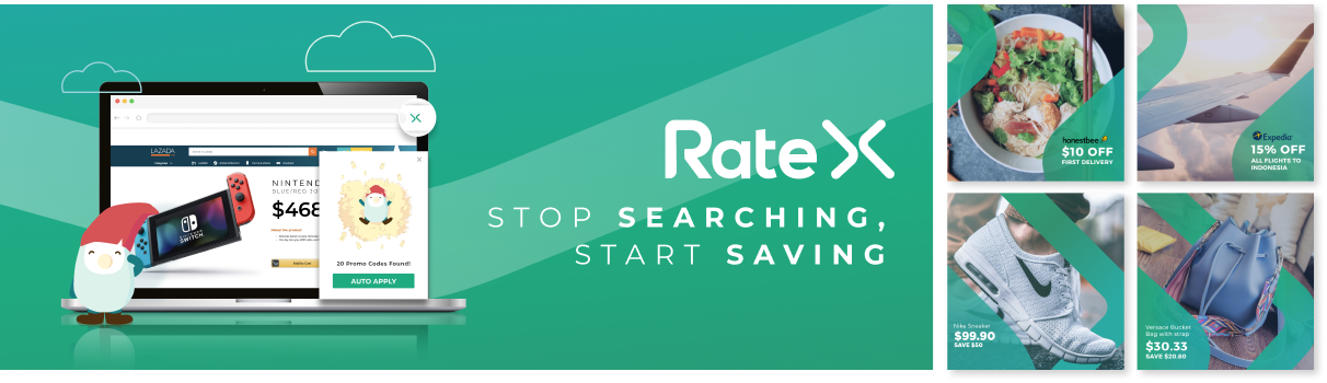
RateX is a Chrome browser extension designed to enhance online shopping by automatically applying promo codes, optimising exchange rates, and enabling cashback, thereby maximizing user savings. Visit the landing page to learn more.
Background
I was tasked to improve the user flow and user interface as there was a need to refresh the usability experience and address some fundamental problems with the user experience.
My role
As Lead Designer, I spearheaded the complete redesign of the RateX Chrome extension and overhauled the landing page. My responsibilities included user research, wire framing, prototyping, and implementing a cohesive design system that improved user engagement.
Problem
User feedback had been collated via our support emails and user testing sessions, where I discovered these three main user issues:
1. There was a general lack of clarity in understanding how the product worked
2. Visually, there was clutter which led to key information and elements to lack salience
3. There was an absence of entry points for browsing and getting started on the product
1. There was a general lack of clarity in understanding how the product worked
2. Visually, there was clutter which led to key information and elements to lack salience
3. There was an absence of entry points for browsing and getting started on the product
Solutioning
Hence, we revisited the whole user journey and user goals on each screen, while seizing the chance to update the overall styling to something friendly and reliable. Some of the key outcomes include:
OUTCOME 1
Enhancing the onborading experience for new users
Considering the slightly intrusive nature of the product, having a guided walk-through of the app would give users a good expectation of exactly how the app would work and when the extension would show up.
New and improved walk-through for a better onboarding experience
OUTCOME 2
Cleaning up the UI by retaining only the essentials
After deconstructing and redesigning the fundamental screens, the new UI was centered around the idea of : 'one core user goal per screen'. A three step design rule was also incorporated that helped transform the interface to something simpler.
Step 1: Reduce it's size
Step 2: Shift it
Step 3: Remove it
I looked at individual elements and started by reducing the size of it. If that didn't work i would shift it. And lastly if that did not work i would just remove it.
Other improvements included improving the design hierarchy as well as simplifying the navigation bar.
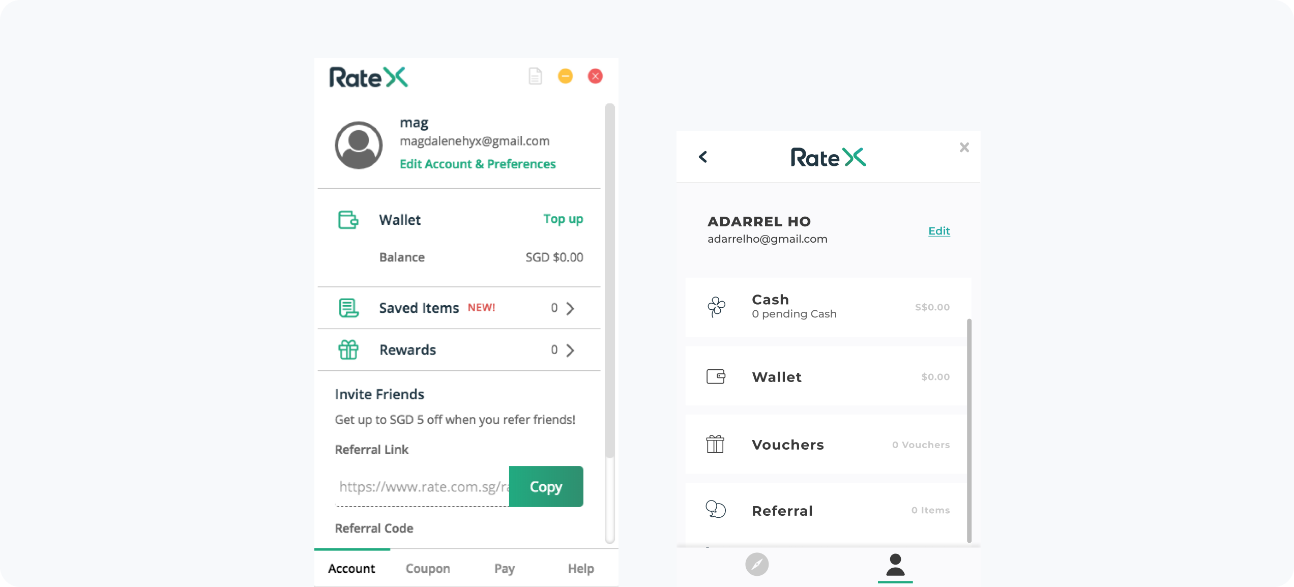
Old account screen vs New account screen
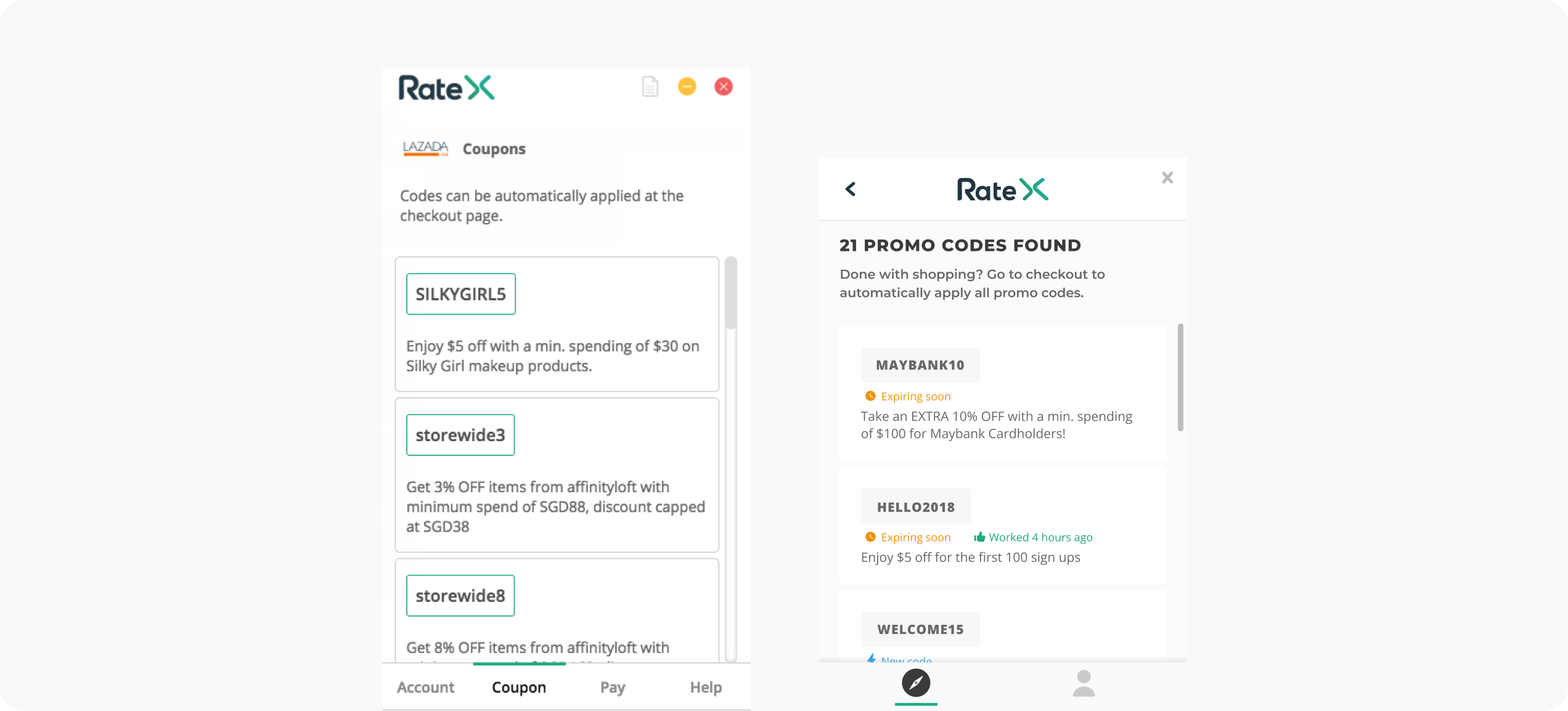
Old coupon screen vs New coupon screen
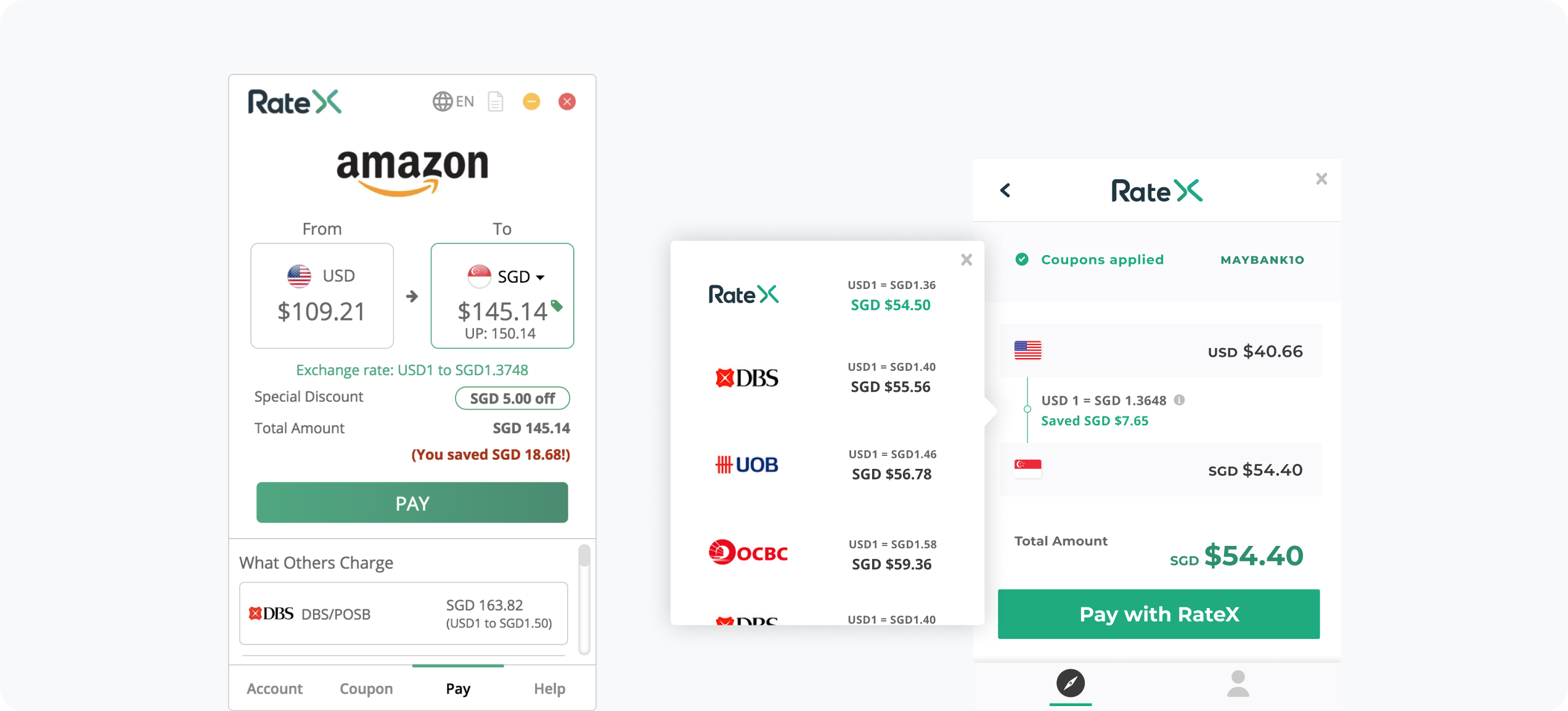
Old payment screen vs New payment screen
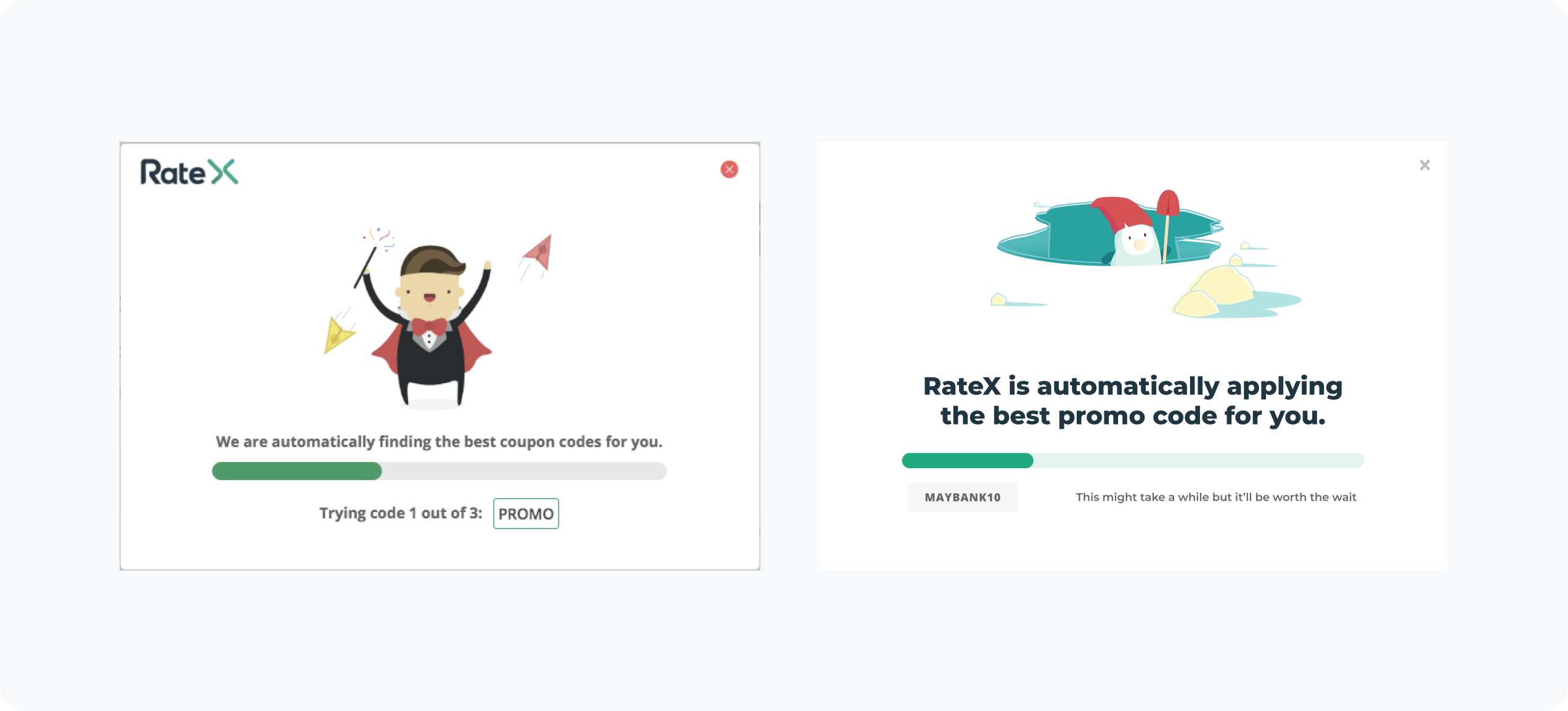
Old applying-code Screen vs New applying-code screen
OUTCOME 3
Optimising for discovery
Previously, RateX did not prompt users to start shopping on their favourite sites. A new browsing menu was added that indicated supported merchants, promo codes and cashback availability. This would then redirect users to the respective shopping sites.
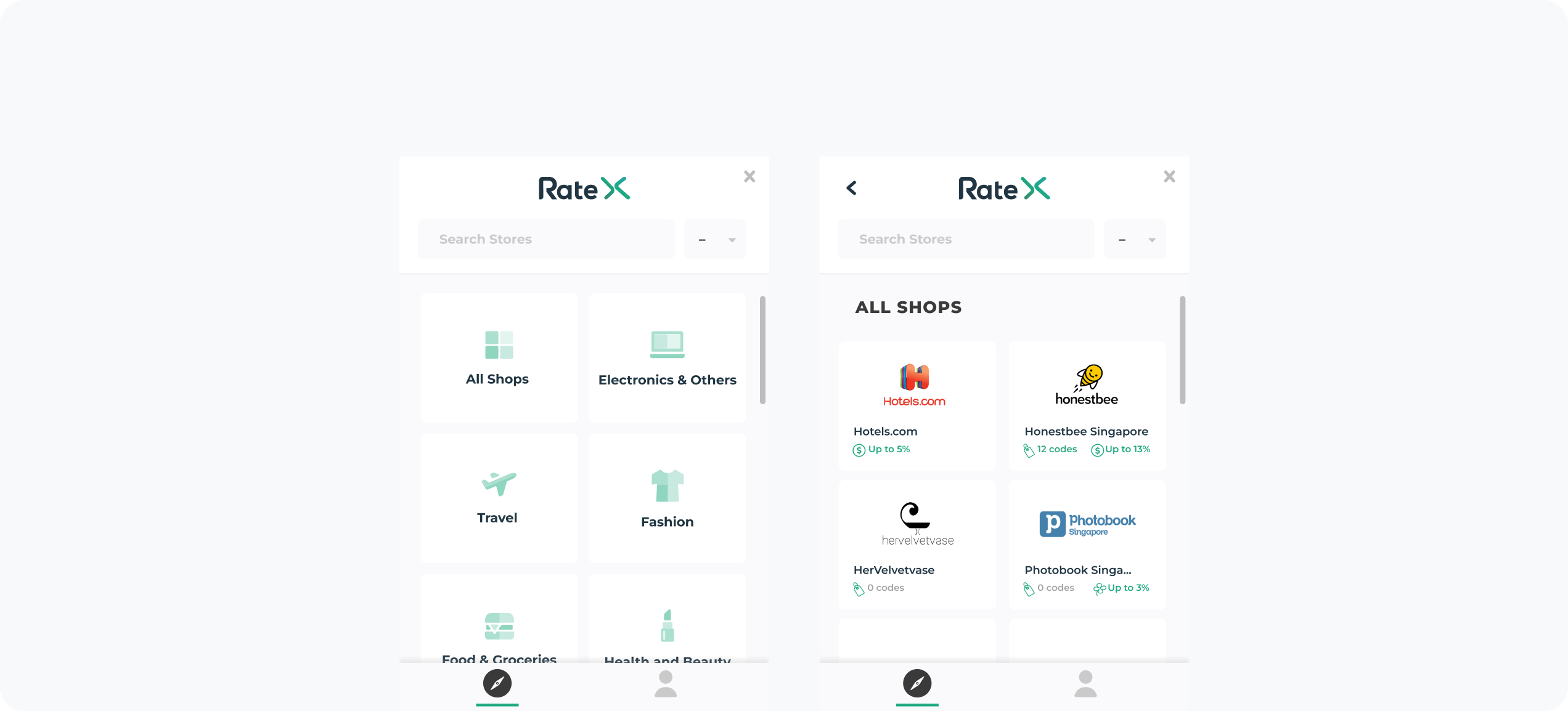
Brand new browsing menu for users to get started
What we achieved
💪 Achieved an 11% increase in conversion rates quarter-over-quarter, directly attributed to the streamlined user interface and enhanced onboarding experience.
👏 8% reduction in new user drop offs from installation to account creation step.
⚡️ Active users spent an average of 20s on the new browsing screens.
Website
Following the app improvements, we carried the same learnings over to our landing page along with a similar style update. The redesigned website was designed and built by me.